How refreshing your storefront can enhance customer experience
With quick-service restaurants (QSRs) balancing an increase in online and mobile ordering with changing expectations for in-person dining, it has never been more important to deliver a great customer experience. And while it’s important to ensure your app and online presence are up-to-date and working well, your physical storefront has an extremely important role to play in the way your customers perceive and interact with your brand.
Here are a few ways how refreshing your storefront can enhance your customer experience.
Keep things fresh
With more than 200 thousand QSRs in North America and the continued dominance of social media in the cultural discussion, the old cliche about making first impressions count is as true as ever. And most often, creating a good first impression starts with maintenance and repairs.
It might sometimes seem trivial, but damage to seating, flooring, and ceilings, among other areas of your restaurant, will be noticed, and if it’s especially bad, it will be shared. You want to stay on top of it as it also has an impact on costs. With the price of vinyl rising, simply repairing and restoring your existing seating can save you hundreds, and possibly thousands, of dollars in replacement costs.
As part of this process, there are also numerous things you can refresh your QSR’s interior to improve the customer experience, including:
Your furnishings, balancing comfort and aesthetics with staff safety and functionality.
Your lighting. LED technology can provide massive cost savings and give you the flexibility to create new moods and improve flow. LED lighting can also be used to create unique features that aid in wayfinding and operational flow. Check out one of our recent projects at a Tim Hortons in Hamilton, where we installed an LED pick-up sign to help customers get their online and mobile orders quickly and conveniently.
The Archmill House team has years of experience overseeing QSR re-imaging projects, and can help you refresh your store with existing fixtures and furniture pieces. We recently completed a full interior re-working for a flagship location of the popular men’s clothing brand Psycho Bunny, including updated furnishings and LED lighting. Get in touch today for a quote.
Avoid clutter
QSRs also need to ensure they are keeping their spaces clutter-free. A cluttered interior can create a chaotic, confusing space, with customers having a hard time finding what they’re looking for. A disorganized, cluttered space also makes things difficult for employees, hindering their movement and increasing wait times.
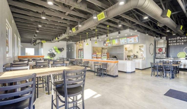
A re-imaging project, which is a fast, cost-effective way for QSRs to refresh an interior, can help you maximize the use of your space. A re-image can include:
Replacing and moving front counters, cabinets, tabletops, and seating
Adding and finding the best location for digital displays and kiosks
Removing and replacing existing fixtures
Installing new flooring
Recladding
A re-image can also help you improve signage and your window display, which should balance visibility and subtlety. You don’t want the first thing people notice to be a confusing eyesore, with an overload of signs and information.
Get in touch with the Archmill House team today for a quote.
Create a comfortable, welcoming space
Apart from serving a great product, QSRs around the world are now aiming to create a pleasant, comforting restaurant environment for their customers. And before you start to worry about what that entails, there are a number of small tweaks you can make to help create a warm, welcoming ambience for your customers, including:
Making sure your QSR is temperature controlled, with air conditioning in the summer and heating in the winter. Many QSRs have even begun incorporating restaurant shade structures over outdoor lines and dining areas, ensuring that the customer experience is pleasant (and sweat-free) even if they never step inside.
Offering free WiFi throughout your space, giving customers something to do while they wait and eat (and also giving them a chance to share their good experience).
Many retailers and QSRs have also started to experiment with design ideas like adding plants, colors, textures, and materials (including custom millwork), to make storefronts look warmer and more welcoming.
Aim for Clarity and Convenience
As we’ve mentioned in our recent QSR design trends post, putting convenience first is a necessary part of providing a great customer experience. Often, that can simply mean looking out for and eliminating anything that can cause confusion, including:
Unclear wayfinding and signage
Confusing delivery pickup locations
Hard to read menus and digital displays
Ultimately, though, customers will measure convenience through wait times. To speed things up, many QSRs have sought to improve that process by adding more counters, self-ordering kiosks, and creating dedicated lines for pickups and delivery. A more extreme example, but perhaps a sign of things to come, is Taco Bell’s High Top restaurant, which is designed to simplify the drive through experience.
While you likely won’t have to go to those lengths, a re-imaging of your space can absolutely help you find ways to make things more convenient for your customers and staff.
Re-imaging is an easy way to freshen up your interior and put the customer first. Archmill House’s Rapid Re-Image program lets you refresh your establishment without the cost and time delays of a full renovation. See what we did for Popeyes and get in touch today for a quote.


